CTFS Tutorials
Source file: http://ctfs.si.edu/ctfsdev/CTFSRPackageNew/files/tutorials/MortalityDBHMortality vs. dbh
GRAPHING MORTALITY RATE VS. DBH
Date: July 20, 2012.
Consider a calculation of mortality rate in dbh categories, estimated by counting survivors among all trees in each group. This is calculated in the program mortality.spp. The purpose here is simply graphing results for many species into a pdf.
Use R Analytical Tables from any two censuses of the same plot. The example here, the tables are bci.full5 and bci.full6. The result of mortality.eachspp is a list, including components rate, upper, lower, and dbhmean.
> head(mort.data$rate)
> head(mort.data$upper)
> head(mort.data$dbhmean)
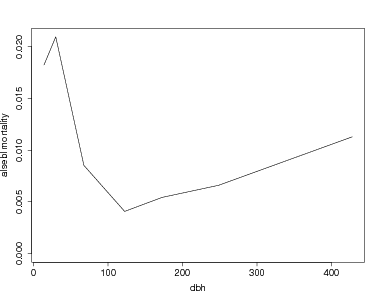
To graph a single species (the call to par is simply to make the fonts larger):
> maxmort=max(mort.data$rate[sp,],na.rm=TRUE)
> par(cex.lab=1.5,cex.axis=1.5)
> plot(mort.data$dbhmean[sp,],mort.data$rate[sp,],type='l',ylim=c(0,maxmort),ylab=paste(sp,'mortality'),xlab='dbh')
To graph more than one species, create a function which creates the graph for one species. An option to change the xrange and yrange of the graph is included. If both are left at NULL, the graph extends to the maximum mortality and the maximum dbh. The function must include a check for infinite mortality rates (which happens when all individuals in a dbh category die).
+ {
+ y=data$rate[onesp,]
+ aproblem=is.infinite(y)
+ if(is.null(yrange)) yrange=c(0,max(y[!aproblem],na.rm=TRUE))
+ if(is.null(xrange)) xrange=c(0,max(data$dbhmean[sp,],na.rm=TRUE))
+ plot(data$dbhmean[onesp,!aproblem],y[!aproblem],type='l',xlim=xrange,ylim=yrange,ylab=paste(sp,'mortality'),xlab='dbh')
+ }
Try the function for a few species. There is an option in the function par to pause between graphs. The first example shows 5 species graphs, all with the same axes. The second example creates a pdf for all species with > 100 individuals, using the output N from the mortality table. (The graphs created are not shown here.)
> par(ask=TRUE,cex.lab=1.5,cex.axis=1.5)
> for(onesp in spp) mortdbh.graph(data=mort.data,sp=onesp,xrange=c(0,600),yrange=c(0,.04))
> par(ask=FALSE)
> fullN=rowSums(mort.data$N)
> allspp=rownames(subset(mort.data$N,fullN>=200))
> pdf(file='allmort.pdf',width=10,height=8,onefile=TRUE)
> for(onesp in allspp) { cat(onesp,'\n'); mortdbh.graph(data=mort.data,sp=onesp,xrange=c(0,600)) }
> graphics.off()